Bus depot – part 1
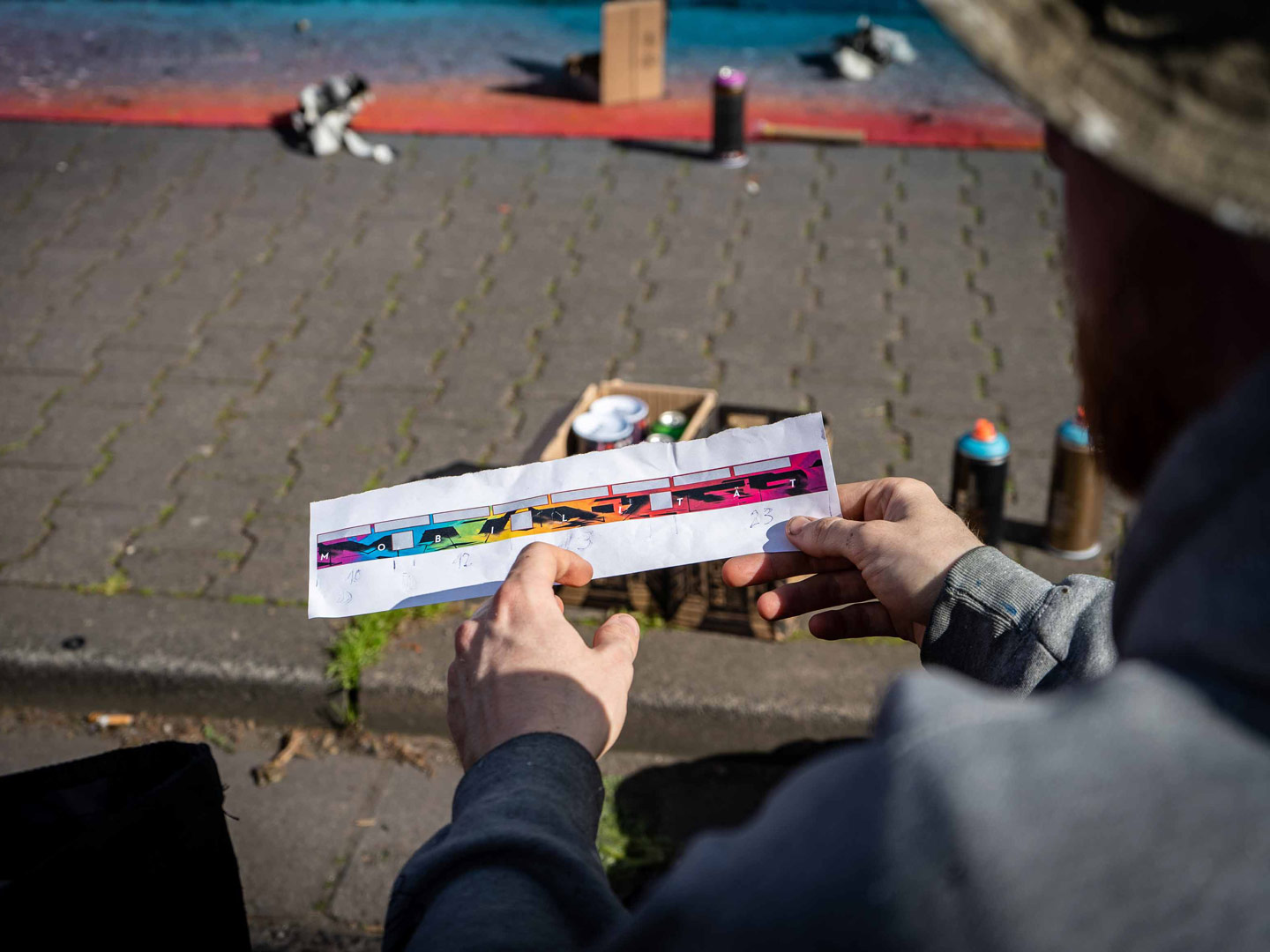
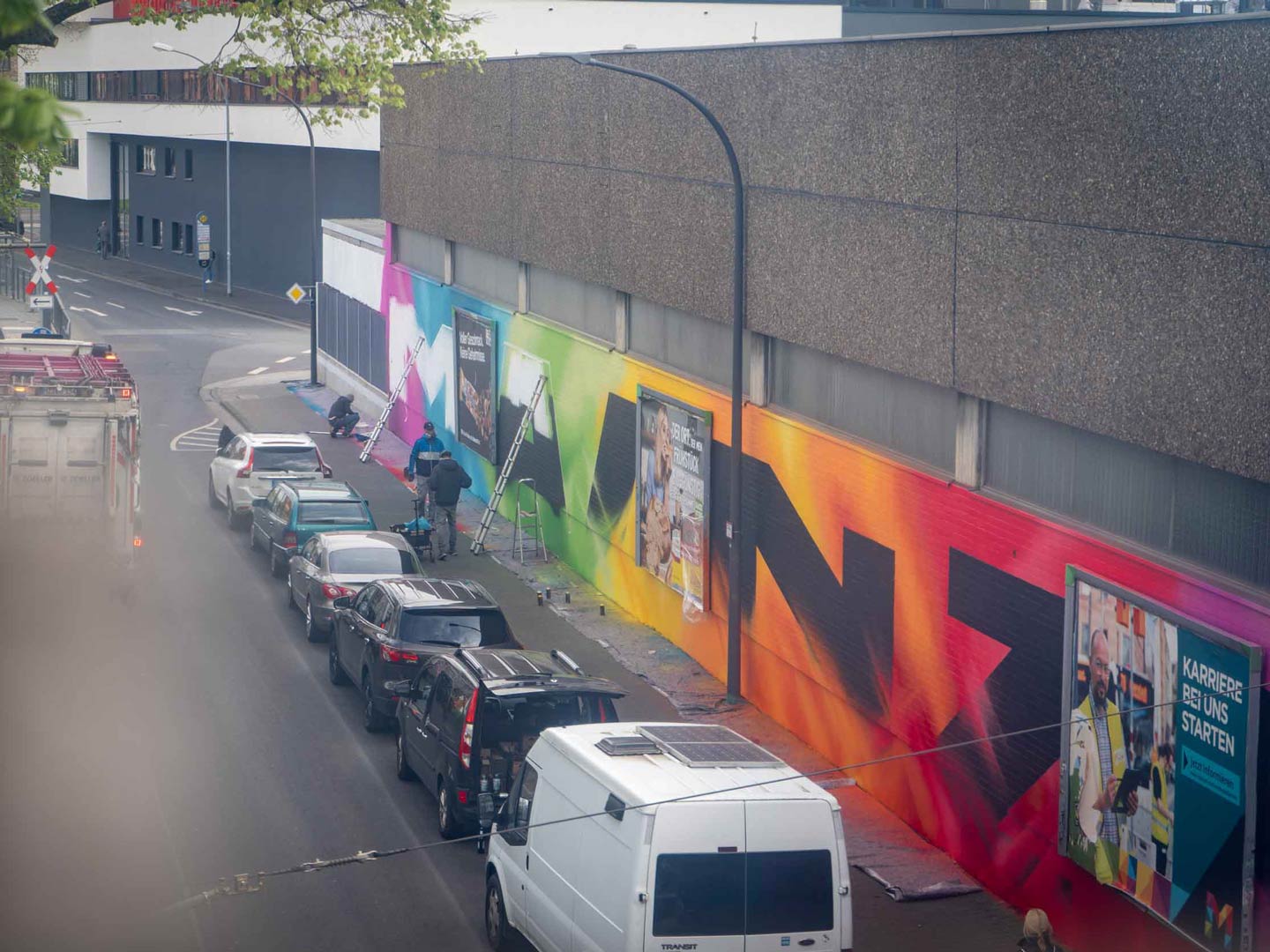
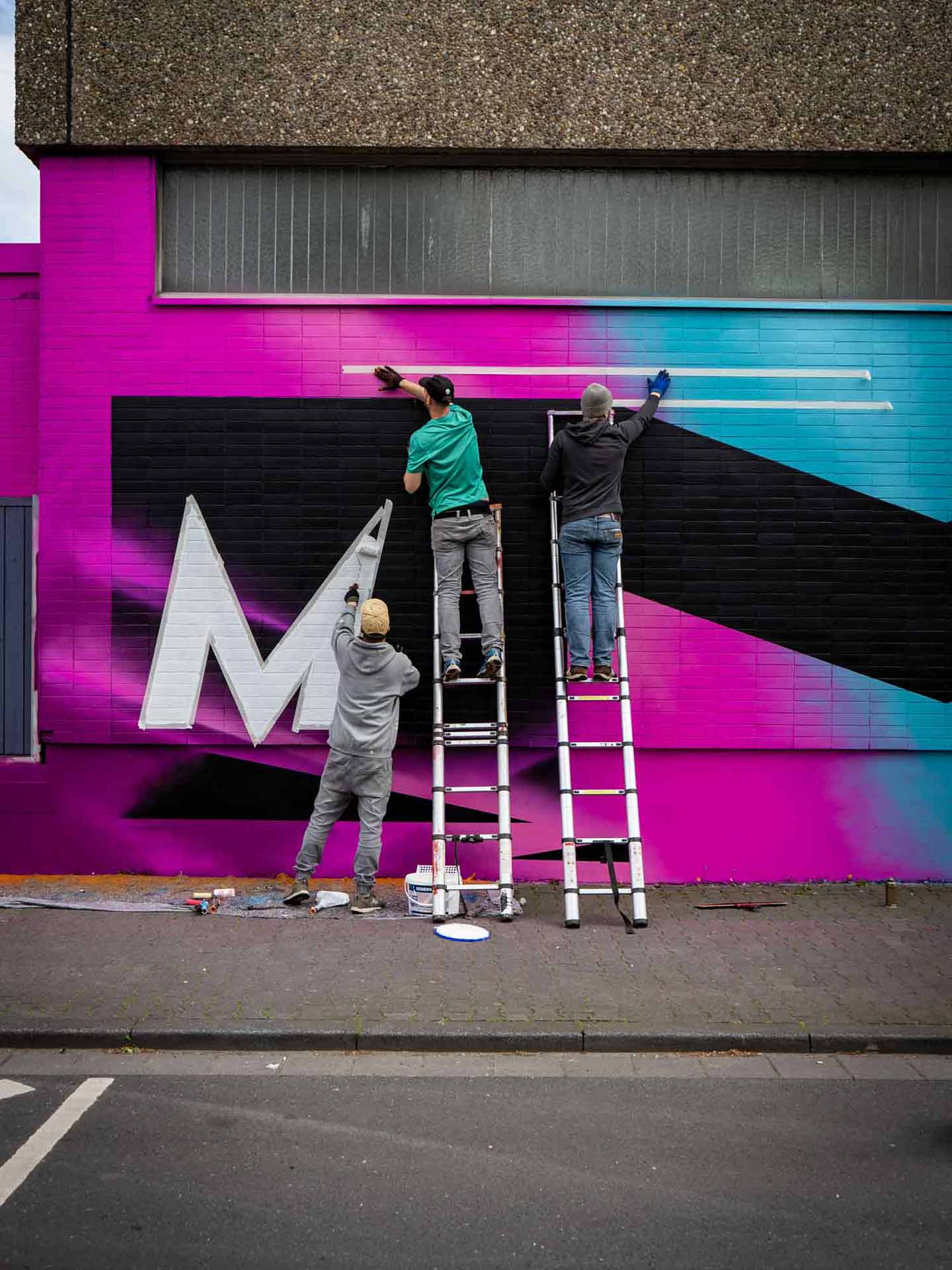
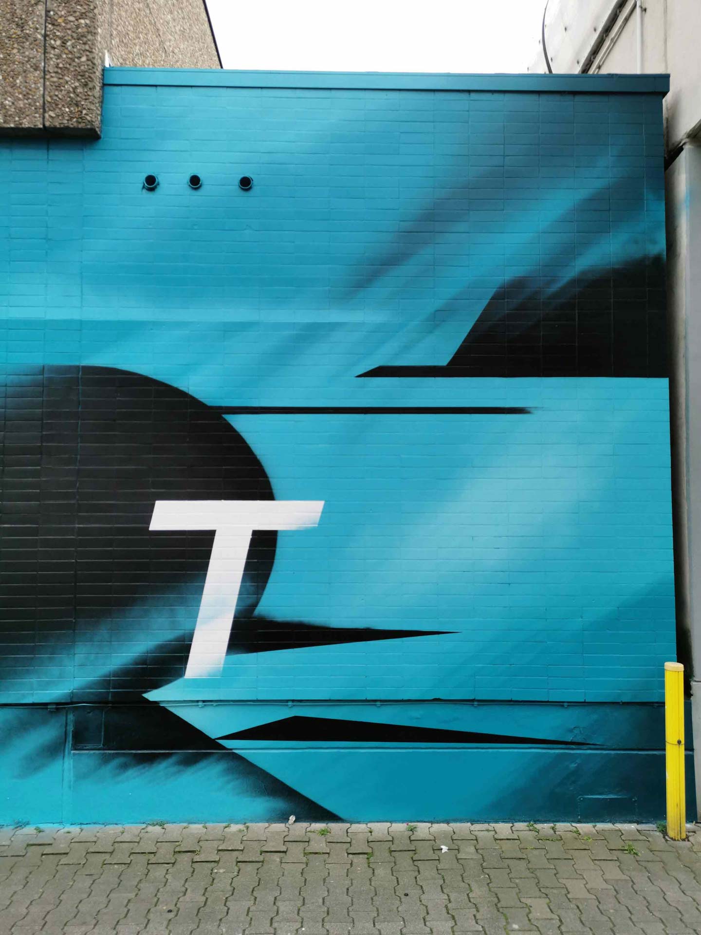
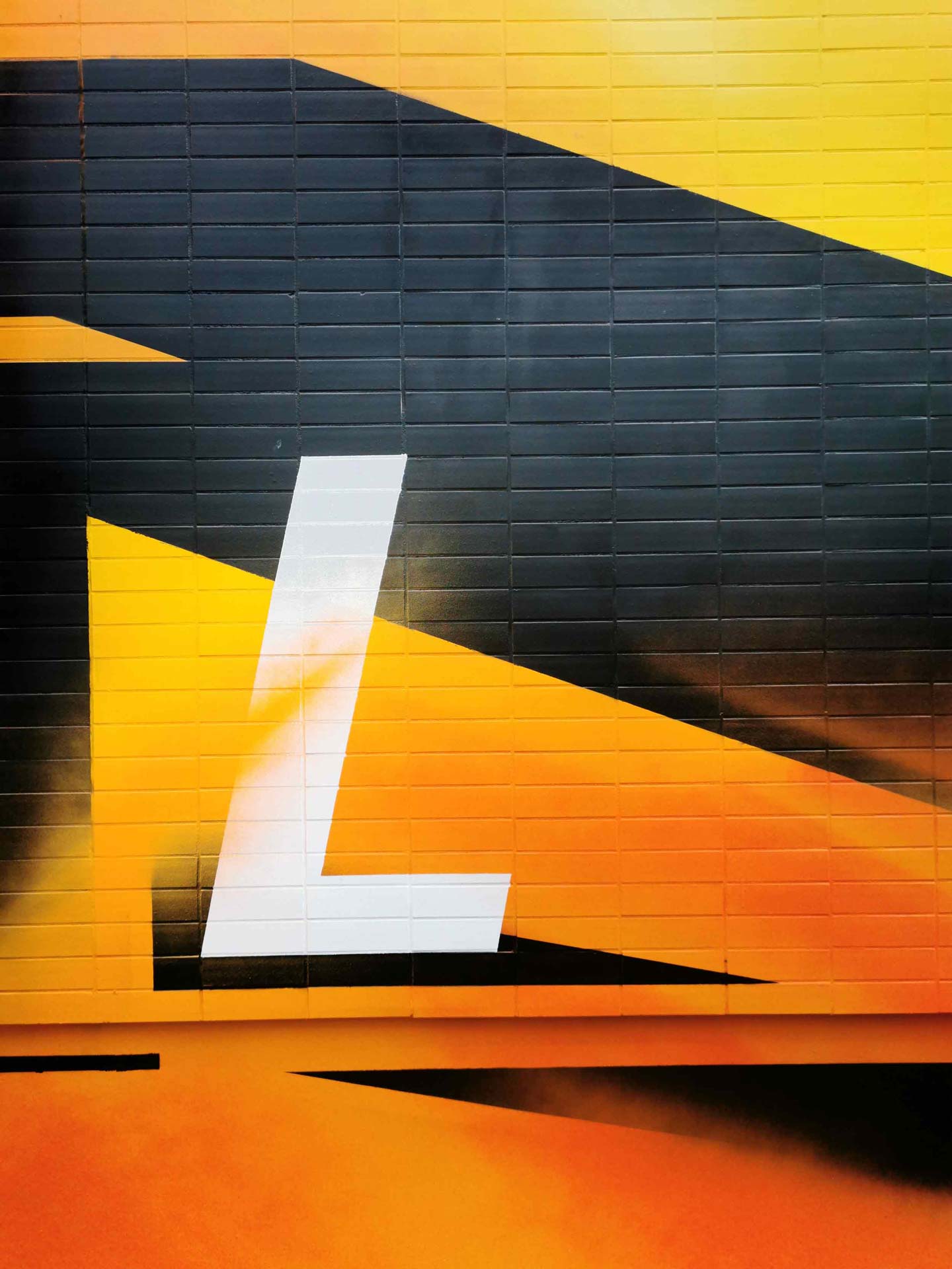
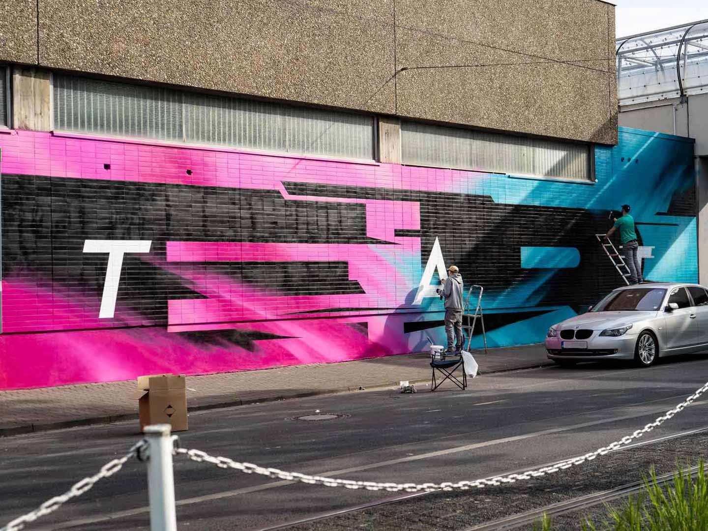
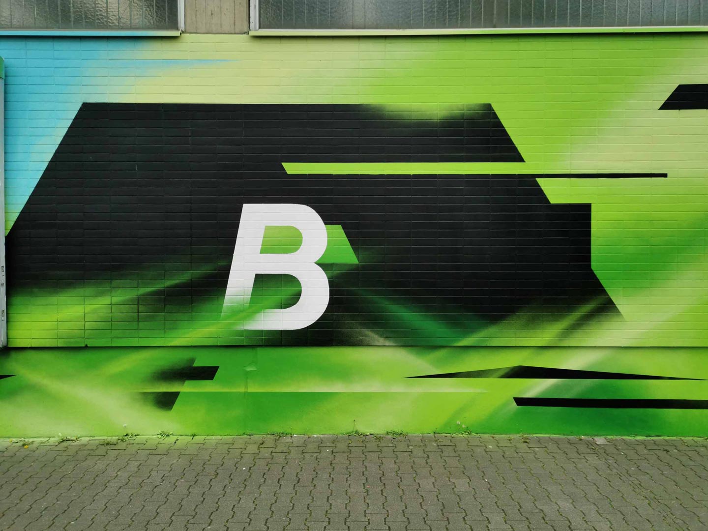
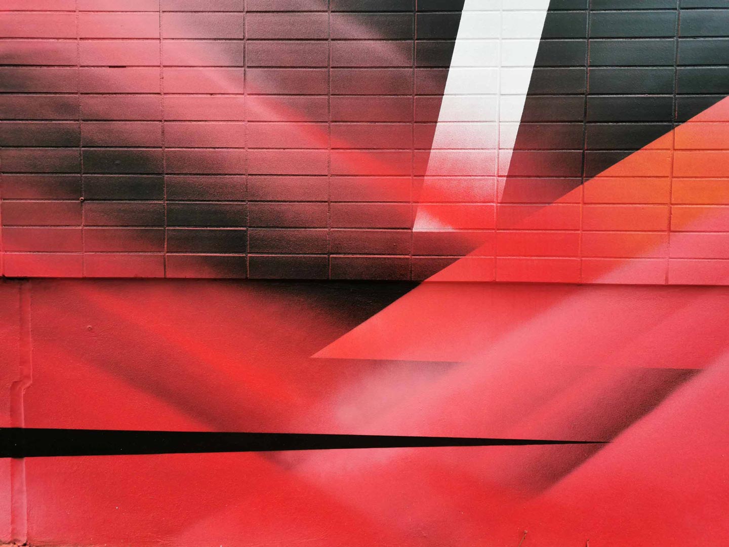
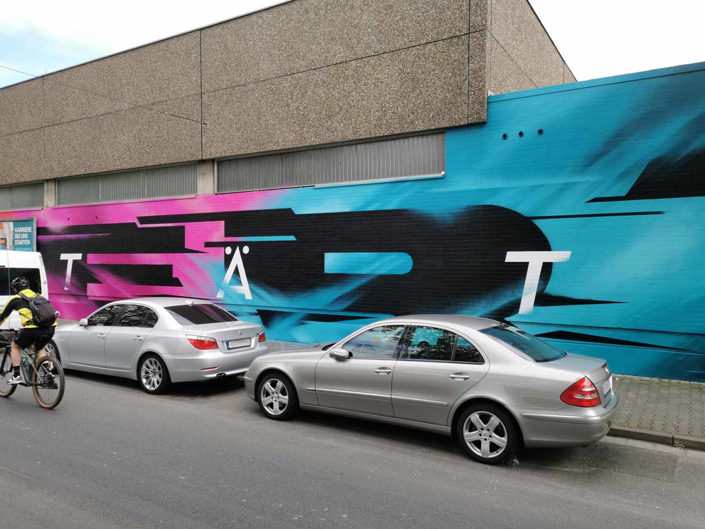
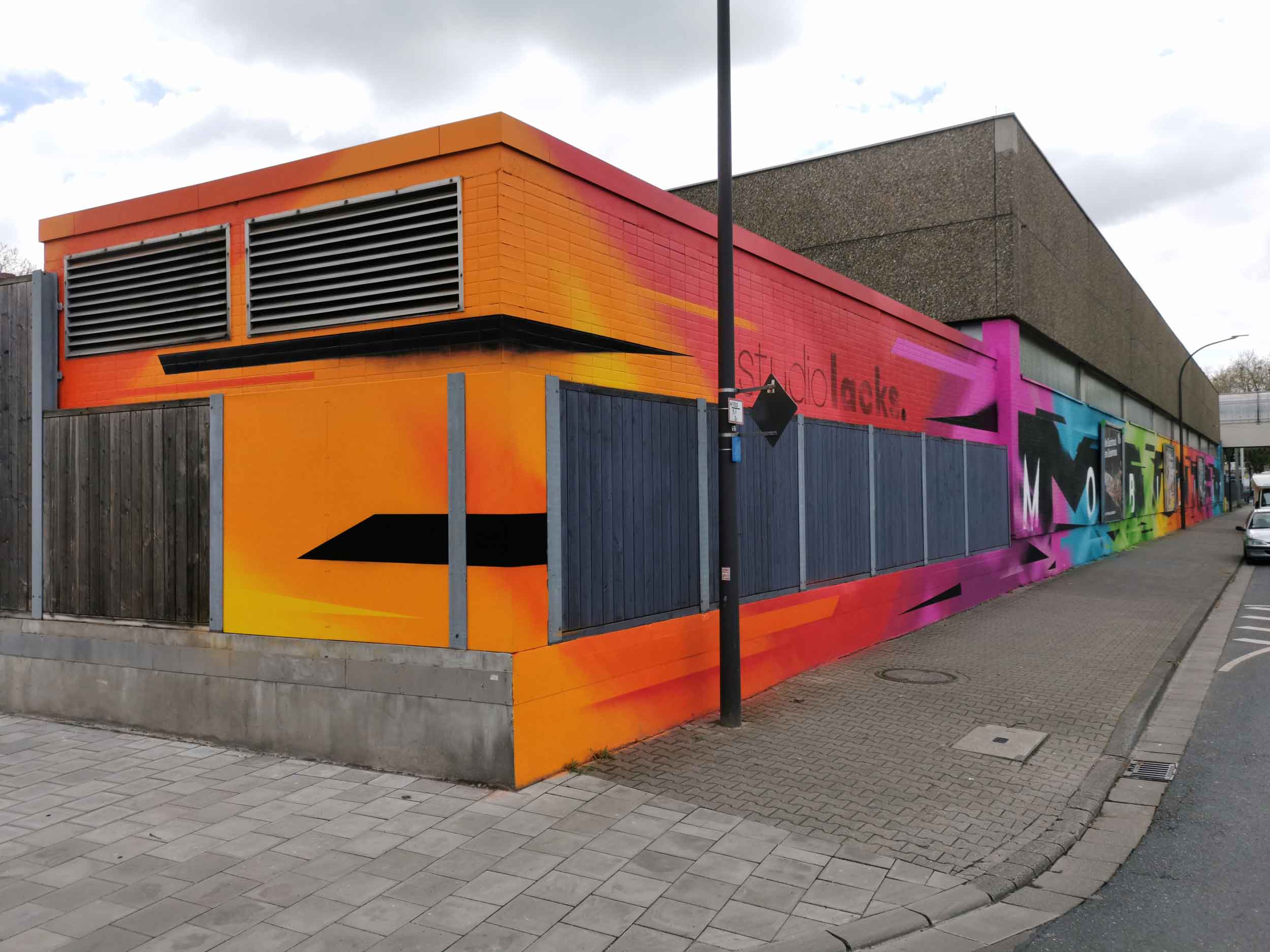
The design on the large wall of the bus depot of Mainz Mobility is based on the respective colors of the corporate identity. In order to create recognition for the company regardless of the chosen form, as many Mainz residents automatically associate this color palette with the MM. In terms of content, we have opted for a dynamic appearance, since the buzzword “mobility” already calls for this aspect in a certain way and the image should also not appear stagnant in relation to the core of the company. The large monochromatic black areas form the word “MAINZER” in an abstract typographic form. The italic lettering “MOBILITY” in the foreground rounds off the overall picture and at the same time clearly communicates the concept.
Interested in your own project?
